We craft intuitive, brand-defining interfaces powered by user empathy, visual hierarchy, and behavioral psychology. Whether creating a zero-to-one MVP, revamping complex B2B enterprise dashboards, or establishing scalable multi-platform design systems, our UI/UX deliverables align business KPIs directly with end-user needs.
In-depth user persona modeling, empathy maps, task flow analysis, and structural information architecture (IA) planning.
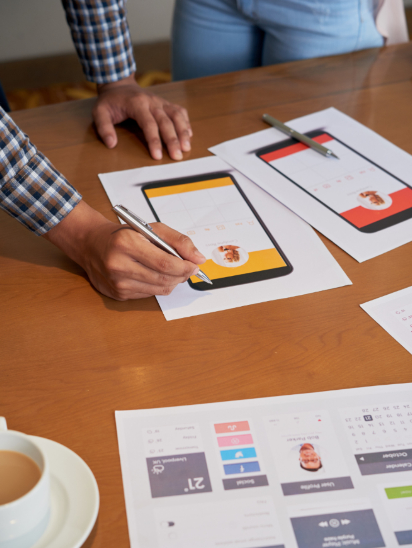
Rapid interactive schematics and layout wireframes designed to iterate navigation models before visual styling begins.
Atomic UI component libraries, responsive typography scales, color tokens, and icon packs built inside Figma.
Modern visual design for iOS, Android, and web dashboards optimized for touch targets, dark mode, and clarity.
Realistic micro-interactions, animated user flows, and usable Figma prototypes built for stakeholder pitches and user testing.
Collaborative wireframing, component auto-layout, tokenization, and interactive prototypes.
Adobe XD, Photoshop, Illustrator, and After Effects for advanced vector art and motion UI.
Zeplin, Storybook, pixel-perfect CSS variable tokens, and developer asset packages.
Maze, Hotjar, Google Analytics user journeys, heatmaps, and A/B test split-modeling.
Tailwind CSS, Bootstrap 5, HTML5 semantic tokens, and clean responsive CSS architectures.
Ready to Elevate Your Digital Product Experience? You can contact us at 8923981920 Or
Hire UI/UX SprintStakeholder interviews, user behavior research, competitor benchmarking, and friction-point discovery sessions.
Sitemap structures, low-fidelity paper and digital wireframes, core interaction flows, and navigational hierarchies.
Applying color theory, brand guidelines, typography hierarchies, custom iconography, and micro-interactions.
Connecting screens into clickable flows to conduct real-world user validation and identify UI friction before engineering starts.
Organizing components, exporting asset production packs, and documenting CSS spacing rules for developers.
Reviewing live staging builds against Figma specs and optimizing user conversion drop-off points via live analytics.
Every button placement, visual hierarchy, and CTA flow is purposefully crafted to lower bounce rates and maximize user actions.
High color contrast ratios, screen-reader-friendly layouts, and intuitive keyboard navigation meeting universal accessibility benchmarks.
Clean auto-layout properties, responsive breakpoints, design tokens, and clear specifications to ensure developers build 1:1 replicas.
Interfaces designed from 375px mobile screens up to 4K ultra-wide monitors with consistent visual polish and clarity.
Collaborate with our senior UI/UX strategists to review your app or website and receive an actionable UX audit and design roadmap.
155 GF, Golden Avenue, Shouryapuram Ghaziabad, UP, India